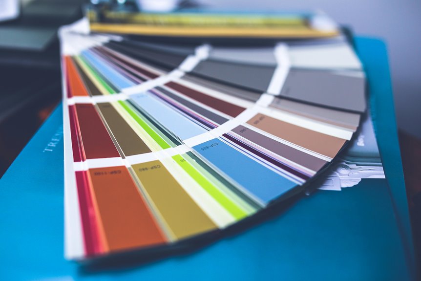
Match your walls and trim if you want a calm, spacious feel. Same colors eliminate visual breaks that chop up rooms, making tight spaces feel larger. The catch? You’ll need different finishes (matte walls, satin trim) to add depth without breaking the look. Labor costs can increase since painters need careful edge work. Historic homes benefit most, though modern spaces work well with it too. But sometimes breaking this rule actually highlights your best architectural details better than playing it safe.
Why Matching Walls and Trim Creates Visual Drama and Cohesion
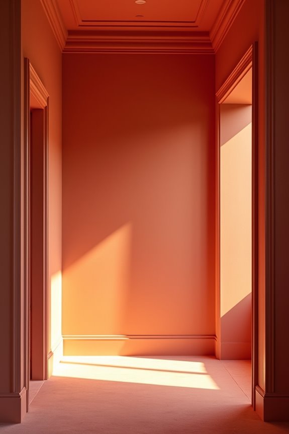
Ever notice how a room with contrasting trim can feel choppy and busy? I’ve learned that matching your walls and trim creates visual drama. When I paint everything the same color, I’m building a unified appearance that feels deliberate and calm. This single-color scheme does something useful—it makes rooms feel bigger because all surfaces recede together. Your eye doesn’t get interrupted by competing lines.
Here’s what I appreciate: this approach lets your architectural features shine without overwhelming the space. Whether you’ve got beadboard, paneling, or built-ins, they become part of the unified backdrop rather than fighting for attention. I can add subtle depth using different sheens—eggshell walls with satin trim—so I get unity without sacrificing dimension. The result? A space that feels thoughtful, spacious, and undeniably polished.
How One-Color Schemes Enlarge and Soften Your Spaces

Why do rooms painted in a single color feel bigger than they actually are? When I paint walls and trim the same hue, I’m eliminating visual breaks that chop up the space. One-color schemes recede boundaries, making even cramped rooms feel more open. This uniform color softens transitions in open layouts, creating flow instead of jarring shifts between adjoining areas.
Here’s what I’ve discovered: varying the sheen—matte walls paired with satin trim—adds depth while keeping that expansive feel intact. It’s the best of both worlds. White-on-white schemes work particularly well for this. They minimize undertone clashes and build a cohesive atmosphere that feels welcoming.
The result? Your space doesn’t just look larger. It looks more deliberate, more complete, more like a home that works well.
Budget and Maintenance Realities You Need to Know First
How much are you actually saving by painting everything the same color? I’ll be honest—it’s complicated. You’ll spend less on materials and labor costs upfront since you’re buying fewer paint colors. But here’s the catch: achieving edge-to-edge coverage takes time, and that extends your labor bill.
The real budget challenge? Different finishes matter for durability. Same color walls and trim means sacrificing protective satin or semi-gloss finishes on trim in high-traffic areas. Your scuffs and upkeep costs climb when trim gets damaged easily.
Plus, sheen mismatches can ruin the look you’re going for. Maintenance becomes trickier too—you can’t hide wear patterns as easily. Consider whether you’re truly saving money or just postponing expenses through increased upkeep down the road.
Finish and Color Decisions That Make Matching Paint Work

So you’ve decided to go monochromatic—now comes the part that actually makes it work.
The key isn’t just picking one color. You’ll want to play with sheens and LRV balance to create dimension without contrast. Here’s what you need to know:
- Use different sheens: Paint walls in matte or eggshell while trim gets satin or semi-gloss, so surfaces stay distinguishable
- Balance white paints: Choose trim with higher LRV and walls with lower LRV to avoid that icy blue look
- Test lighting conditions: The same color shifts dramatically under different light, so commit only after multiple tests
Before painting, prime over contrasting colors to prevent color shifts. Machine-color-matching whites eliminates guesswork. These finish and color decisions create a cohesive look that works in your actual home.
Matching Walls and Trim in Historic Homes and Modern Spaces
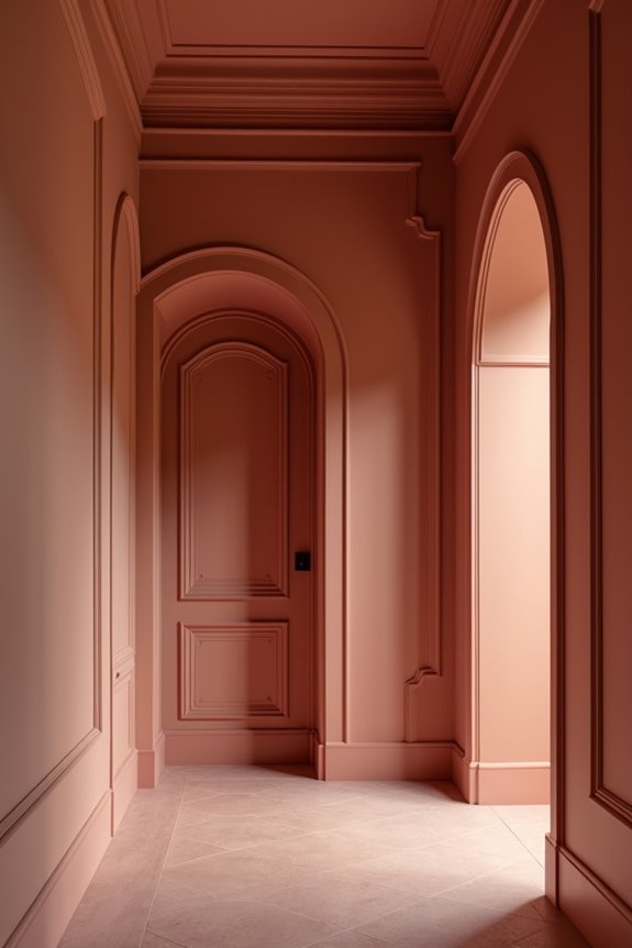
When you walk into a 1920s cottage with soft cream walls flowing smoothly into matching trim, there’s something quietly powerful happening—the space feels organized and cohesive, even larger than it actually is. I’ve found that matching walls and trim in historic homes creates that vintage warmth while unifying architectural details like beadboard and wainscoting. The trick? Manage your sheens carefully. I use eggshell on walls and satin on trim to maintain subtle depth without stark contrast.
In modern spaces, this same one-color scheme works equally well. A soft white or warm beige across all surfaces expands space perception, especially in rooms crowded with doors and windows. The result? Less visual clutter, more breathing room. You’re not just painting—you’re making deliberate interior design choices that improve how your home functions and feels.
When (and Why) Breaking the Rule Makes Sense
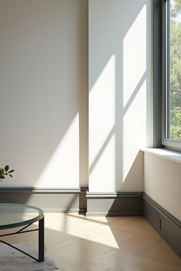
That unified, monochromatic look works beautifully—until it doesn’t.
I’ve found that breaking the matching rule creates interest in certain spaces. Two-tone trim against same color walls highlights architectural details you’d otherwise miss—crown molding, paneling, built-in shelves become more visible. Here’s when I reach for contrast:
- High ceilings or bright rooms: Lighter walls with darker trim maintain depth without feeling washed out
- Small spaces: Contrasting trim defines visual edges, making rooms feel deliberate rather than flat
- Historic homes: Two-tone approaches preserve historical character that single-color schemes can diminish
Even varying sheen levels—eggshell walls with satin trim—creates subtle dimension while keeping unity intact. The lighting impact matters too. Strong natural light bounces differently off contrasting surfaces, adding richness.
You’re not abandoning cohesion. You’re just being smarter about it.